Some interesting maps for Immigration Research
Maps are important tools for genealogy research. For most researchers, immigration research plays a large part in connecting our ancestors as we move farther back in generations of a family. Often, people went where others that they knew had already gone, and if you’ve done FAN research (a term coined by Elizabeth Shown Mills of researching Friends, Associates, and Neighbors), it wouldn’t be a surprise to to find a large portion of an immigrant population in a certain town having roots in the same village or area of their country of origin.
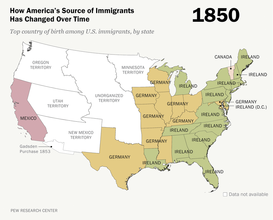
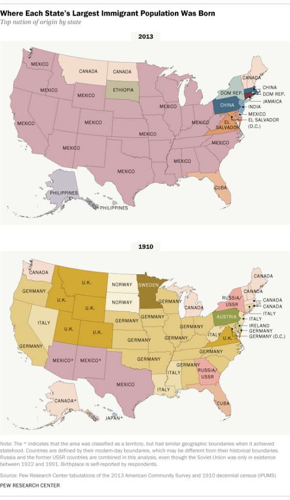
I recently came across an interesting map-type of infographic produced by the Pew Research Center, which I thought might be of particular interest in genealogy research, so I’m sharing them here. Both are interesting, but I found the second map particularly so, seeing how the source of immigrants to different US States has changed over time.
Scroll down to see these maps: Where Each State’s Largest Immigrant Population Was Born and How America’ Source of Immigrants Has Changed Over Time.
1. Where Each State’s Largest Immigrant Population Was Born
2. How America’s Source of Immigrants Has Changed Over Time